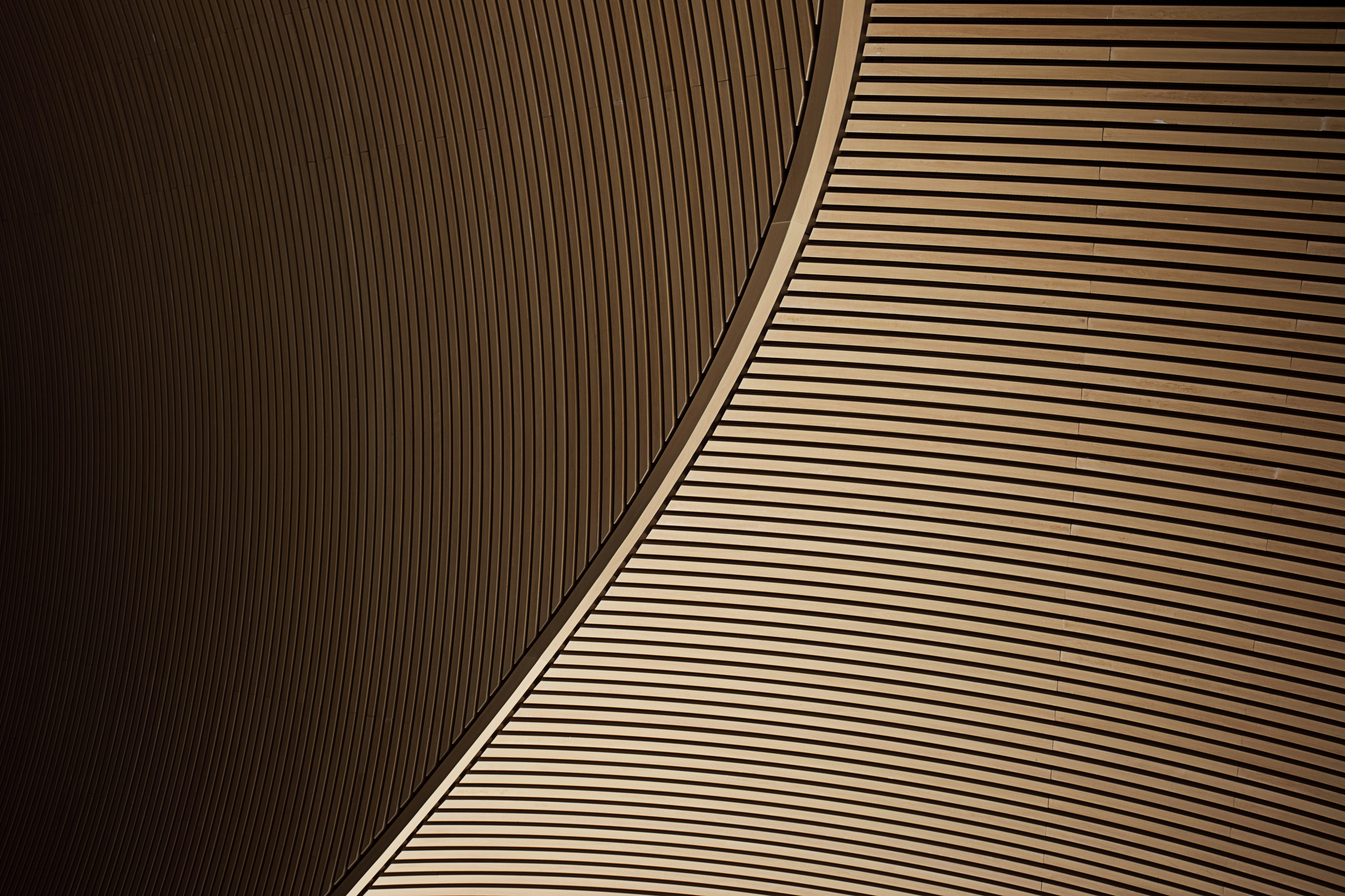
The Limestone Rooftop space sits atop the Cambria Hotel Austin Downtown. The team at the Limestone was looking to revamp their website to match their new aesthetic. Their goal was to craft a contemporary and sophisticated website that authentically showcased the space and celebrated the breathtaking Austin skyline.
CONCEPT: A contemporary and sophisticated website that authentically showcases the space.
CLIENT: Limestone
ROLE: UX/UI, Website Design
TOOLS: Figma


Problem
Users want to explore the restaurants and event spaces at Limestone but struggle to find the information they need online. This makes planning their visits frustrating and discourages them from engaging with what Limestone has to offer. We need to create an easy-to-navigate platform that clearly showcases dining options and events, helping users discover and enjoy their experiences more fully.

Guidelines
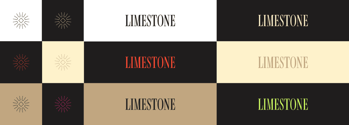
The brand guidelines were given to me by the client. They asked that I work within the guidelines to create a design that reflects the hotel's upscale brand identity, while infusing a modern and sophisticated touch to resonate with the target audience.
Design & Iterate
The design process began with low-fidelity wireframes, then progressed to high-fidelity wireframes and prototypes to iterate and refine the design.
This Section Includes:
Lo-Fidelity Wireframes
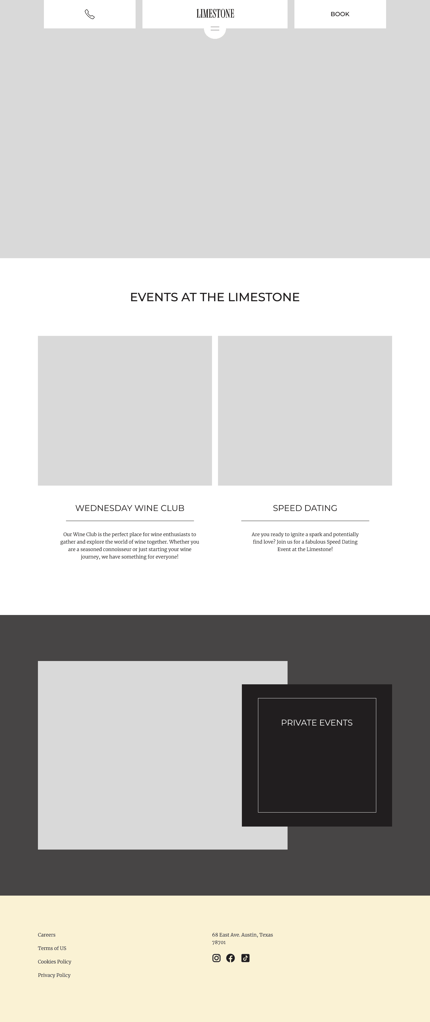
The low-fidelity wireframes were created as an initial step in the design process to outline the basic structure and layout of the digital product.


Hi-Fidelity Wireframes
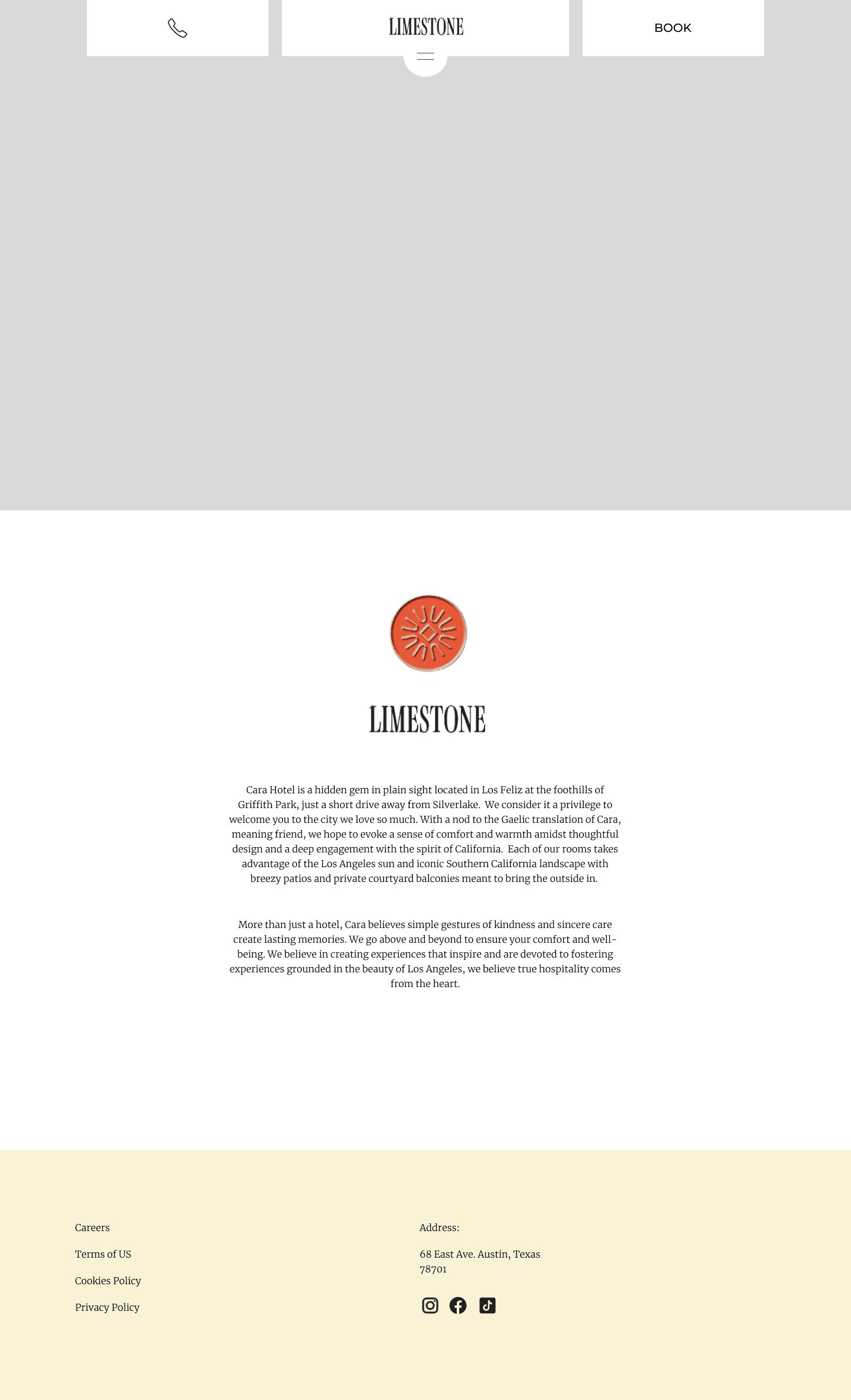
I incorporated design principles such as contrast, visual hierarchy, and consistency to create high fidelity wireframes for the Limestone rooftop space. These choices effectively captured the client's vision for an elegant yet sexy atmosphere, resulting in a visually appealing and user-friendly solution.


Prototype
I brought the high fidelity wireframes to life by creating an engaging prototype that showcased the seamless user experience and dynamic interactions of the design. The prototype not only captured the aesthetics but also allowed for user testing and iteration, ensuring that the final product met both the client's vision and the end users' needs.
Making it Responsive
I made the design mobile-friendly by creating a layout that works well on smaller screens and is easy to use with touch controls. This ensures that the design is accessible and user-friendly across different mobile devices.