
A new website for the Embassy Suites LAX location that showcases modern design, smooth navigation, and enhanced functionality, all geared towards providing visitors with a compelling and user-friendly online experience.
CONCEPT: Modern design, seamless navigation, enhanced functionality for a compelling user experience.
CLIENT: Embassy Suites LAX
ROLE: UX/UI, Website Design
TOOLS: Figma

Problem
I had the opportunity to lead a website design project for Embassy Suites LAX. My focus was on developing a user-friendly and visually captivating website that stayed true to the client's brand identity and provided an exceptional user experience for the hotel's visitors.

Discover
The first steps were looking at the brand guidelines and surveying the competitive landscape to better inform design decisions.
This Section Includes:
Guidelines
The brand guidelines provided by the Embassy Suites served as the foundation for the website's visual identity. By sticking to the brand guidelines, I ensured that the final design not only aligned with the client's expectations but also upheld the essence of the Embassy Suites LAX brand. This approach facilitated a seamless and unified user experience, reinforcing the brand's image across the website.
Competitive Landscape
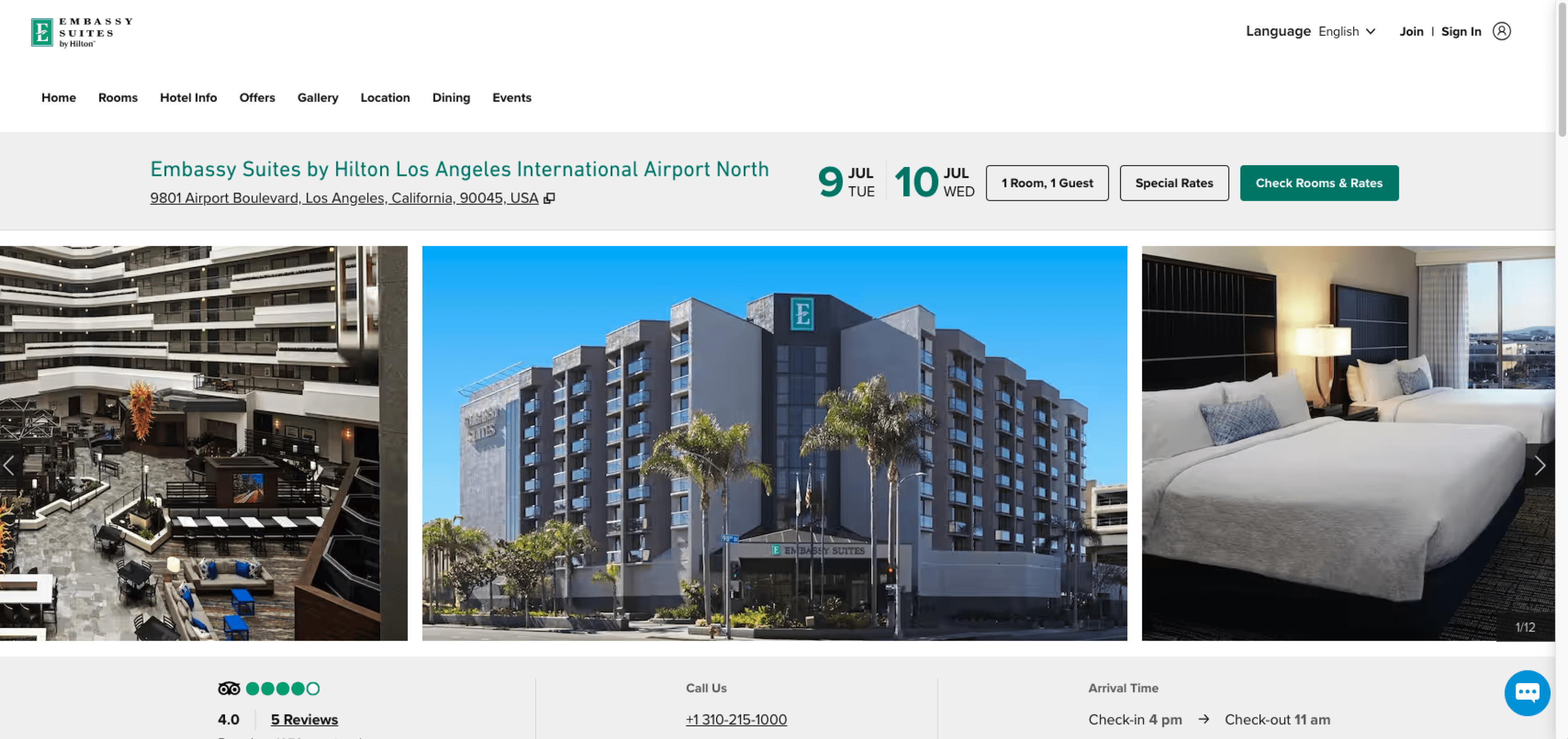
I looked into other Embassy websites and competitors to understand the current market trends and identify potential opportunities for improvement.
Findings
Offer the "BOOK NOW" button as a call to action throughout the website to encourage visitors to take immediate action and easily access the booking process. This will help streamline the user experience and drive higher conversion rates.
Include attractive imagery of the hotel that captures its unique features, stunning amenities, and the overall experience that guests can look forward to.
Adding a contact section at the bottom of each page will make it easier for users to find important contact information. This will greatly improve the overall user experience by making it more convenient for visitors to access the information they need.
Design & Iterate
I began by creating low-fidelity wireframes and then transitioned to high-fidelity mockups in order to refine the visual and interactive aspects of the design.
This Section Includes:
Hi-Fidelity Wireframes
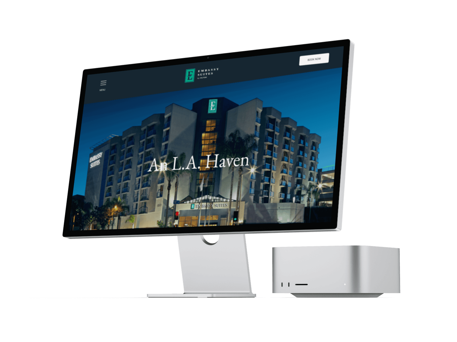
I created Hi-Fidelity Wireframes to show how the design would look once it has been developed. I went through a couple of iterations with the client and this is the design we landed on. The final design incorporates user feedback and aligns with the client's vision for the product.

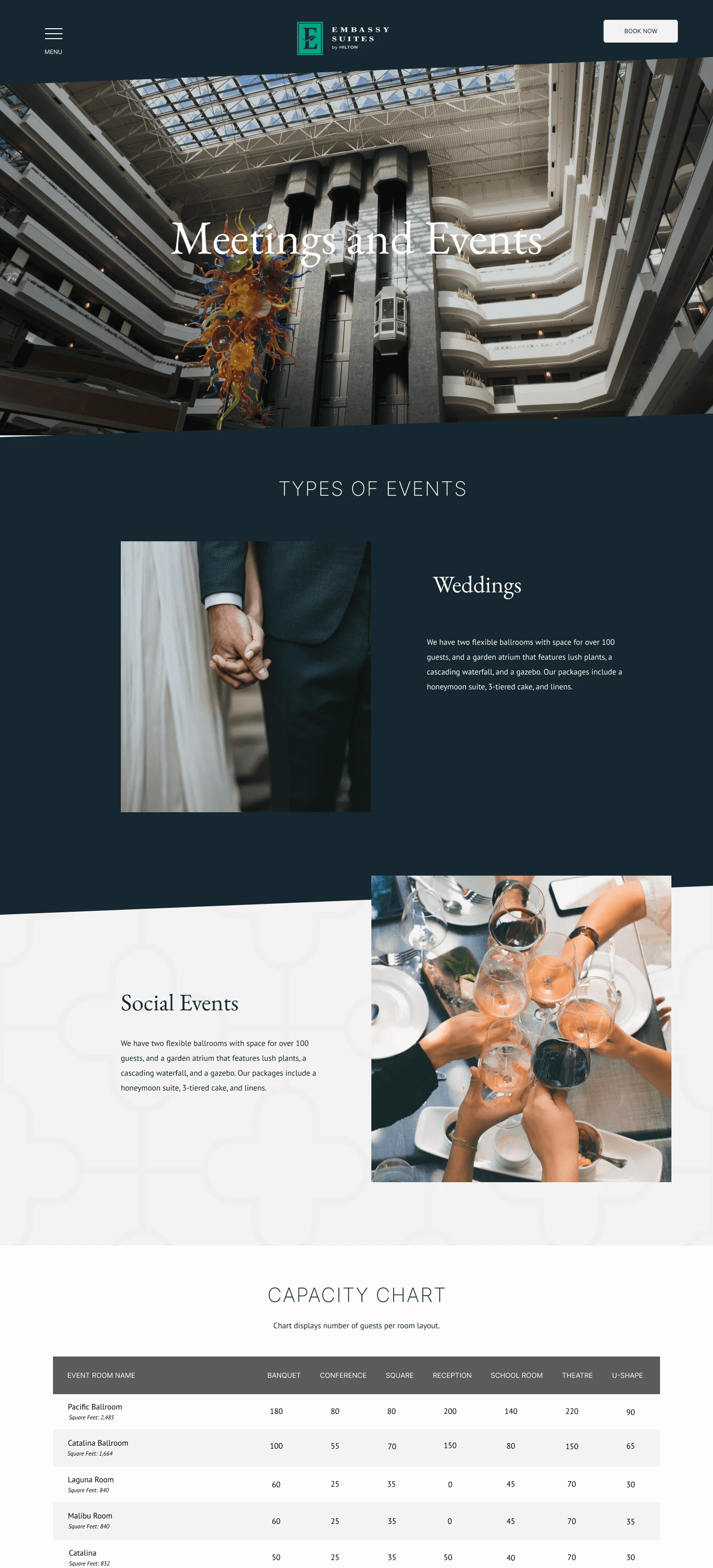
Hi-Fidelity Prototype
I transformed the high-fidelity wireframes into an interactive prototype that highlighted the smooth user experience and dynamic interactions of the design. This prototype not only captured the visual appeal but also enabled user testing and iteration, ensuring that the final product aligned with both the client's vision and the end users' needs.


Emily Ferguson 2024
Work/About/Contact